Glitcheon
Presenting the new Glitcheon logo
Hey everyone! This is Yän, the artist and audio guy of Glitcheon. Hope you're all doing great.
Recently I've been working on a long needed overhaul of the way we present Glitcheon to the world and I'm excited to finally share it with you!
The problem
The old logo that I put together quickly in 20 minutes has served us well in the beginning. It fulfilled its purpose and had its use for a while. However, we noticed that it was no longer good enough when we received some much needed feedback by Chris Zukowski talking about our steam page in a Youtube video on our friend Jonas Tyroller's channel.
According to him - and we really needed to hear this - the logo looked like we just went into Photoshop and applied some corny fire-filter to a font - not a good first impression!
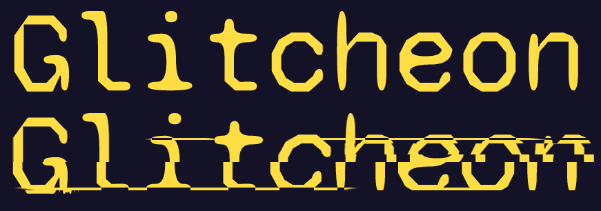
The old logo
And I must admit that he's absolutely right! I just got so used to seeing it that I thought it looked fine and didn't need any change. Looking at it now in comparison to the new one... I can see how the change was much needed though.
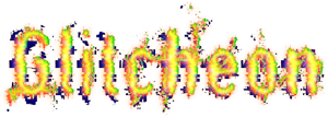
Besides the usual issues of just giving a bad first impression, there were also numerous other problems with this.
- Too much noise around the letters
- Can't turn it into a clear silhouette-logo
- No connection to THE FORUM
- Too many colours all around
- The t is sort of hard to read
- Does not read well on a bright background
And so on...
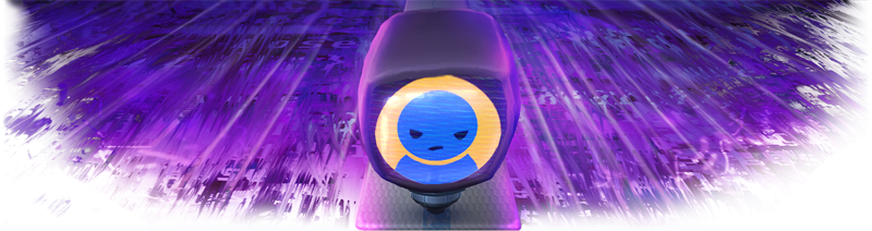
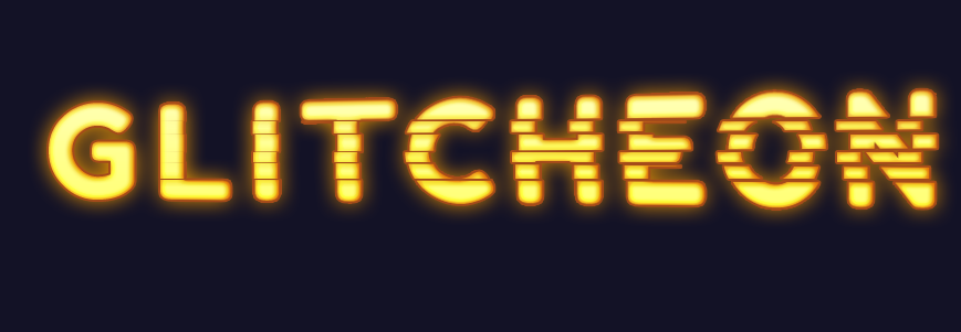
The new logo
Ok, enough about the old one. Let's see what I came up with for our new logo!
This is it! I hope you all like it as much as we do!
Design considerations
With the new logo I wanted to fix all the problems the old logo had. For this, I made some guidelines for myself and... boy did I have a tough challenge ahead of me. Here were my rules:
- It has to be readable at a small size
- It needs a clear silhouette
- It has to still work if it's just flat with only one colour
- It should have noticeable glitchy elements
- But it still needs to be easily readable, both at small and large sizes
- It should be in-universe and relate to the game / the lore
- It should show the progression of getting more glitchy over time
- It should be recognizable with some unique visual element to it
I find that it's pretty useful for creativity to set constraints but man, this was a tough list and I struggled with it for a long time before we got to the point where we are now.
A difficult process
At first I wanted to make it resemble the old logo but in a cleaner way, so I kept using a simplified version of the old-logo font "Astonished". My attempts with this always resulted in something unreadable or with glitches that were too hard to notice. And there were many attempts!
Neither me nor the rest of the team were happy with any of these attempts. River suggested to try out some different fonts as we were not getting anywhere with this.
So I tried a monospace font he suggested and...
Well, it was a bit better, I actually kind of liked the shape of the glitch effects but we still found it just not unique OR readable enough. I found that I just couldn't get noticeable glitch effects going with such thin letters while still keeping the readability. So we opted to go t h i c c !
Getting there...
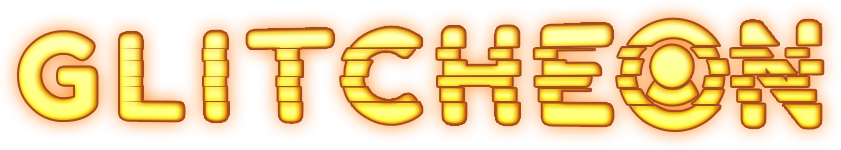
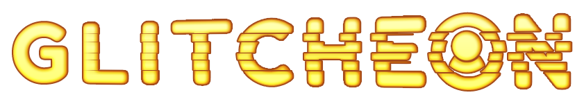
After going through a few fonts with thicker letters, I settled on Fredoka One. I just liked how simple and modern it looked in ALL CAPS and how round its O was. It also gave me a lot more freedom to apply notable glitch effects that get stronger and stronger from left to right.
I came up with this design:
It was pretty nice and slick and both of my teammates liked the direction but I felt like it was still missing something. Something that would make it undeniably OURS.
At first I thought adding our character to the logo would help, kind of implying that Glitcheon zooming past the text is what made it glitchy but it broke the simplicity and Bonicle rightfully hated it. So I remembered how I added THE FORUM's logo into the logo for our game Don't Get The Job. That was in the O - our logo had a round O too! And so, after a few attempts, we finally landed on our winner!
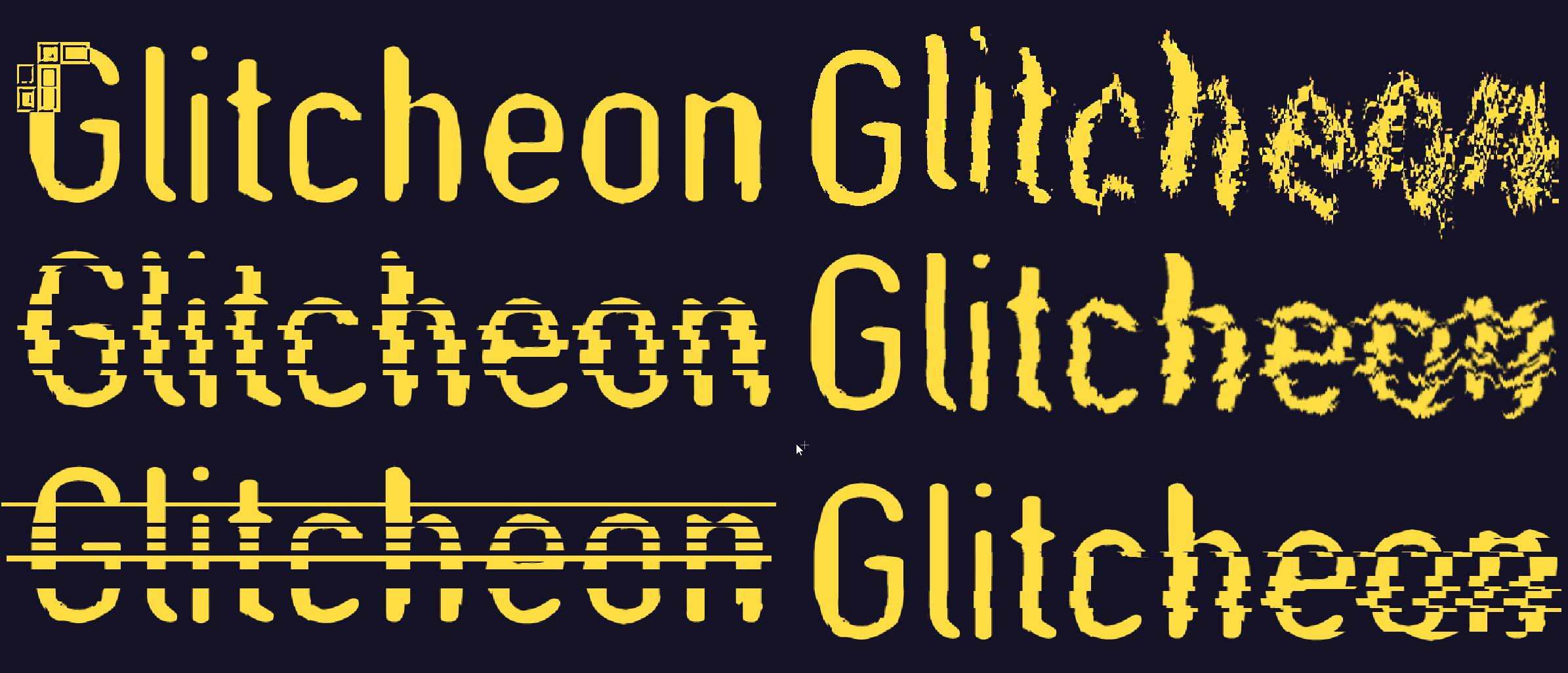
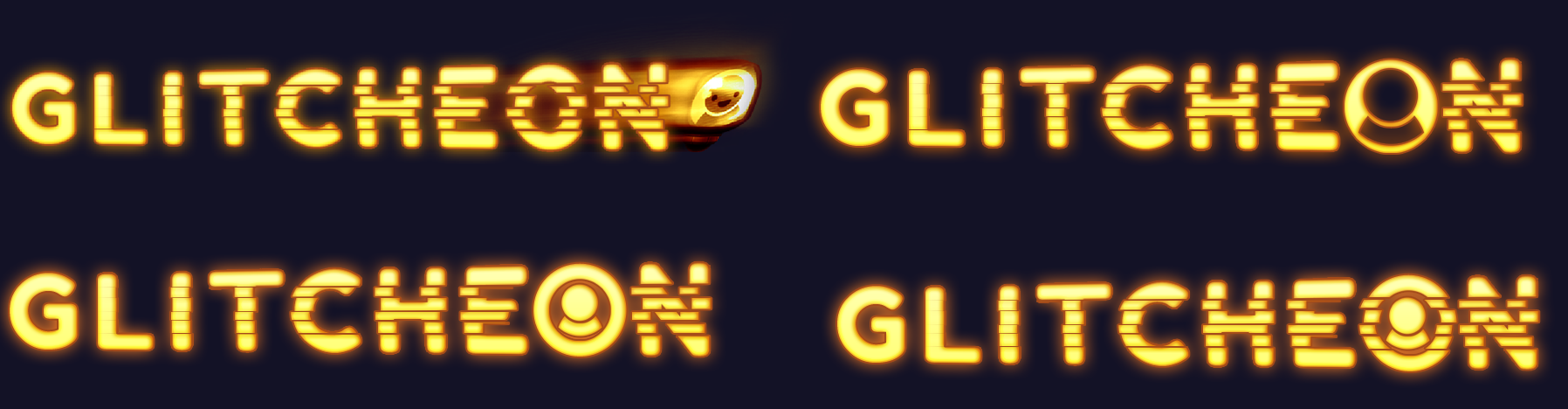
Variations
Now, of course I added a nice glow effect to our logo to keep it within the artstyle of the game and just generally for style points - but one cool thing about this new logo is that it's instantly recognizable as a silhouette too! So, to finish off this devlog, here are some variations of the new Glitcheon...


Thank you!
Thank you all for reading and for the incredible support so far!
Again, I sincerely hope you all like what I've showed you today and can welcome this new look with open arms, eyes and minds. I know, change can be difficult, especially when you've gotten used to something for a while but I do think that this change is certainly for the better.
Alright, that's it from me... Now it's time to replace our thumbnails and banners everywhere! Hope to see y'all on our Discord!
Cheers
- Yän
Comments
Log in with itch.io to leave a comment.
this was awesome and inspiring
Good work as you introduce player character in the logo and changing the glitch intensity on the text makes it much easier to read 🎉